Petit Duc
Responsive Website Redesign of a Climate-Focused Event Platform
UX/UI design
Client Website Redesign

Overview
A client website redesign that helps event planners better understand and adopt sustainable event planning through a clearer, more strategic digital experience.
Client: Merisia (Sherbrooke, Quebec, Canada)
Timeline: 5 weeks
Role: UX/UI Designer
Team: 3 UX Designers
Tools: Figma
Year: 2026
Background
Petit Duc is a sustainability platform developed by Merisia to help event organizers measure, understand, and reduce the carbon footprint of their events. The client sought a website redesign to better communicate its value and improve the overall user experience.
Problem
The current website lacked a clear value proposition, intuitive navigation, and compelling content, making it difficult for prospective customers to understand the product and its benefits.
Solution
Working with a team of three designers, we redesigned the website with a clearer information architecture, clearer content, and a cleaner, more professional visual identity to better communicate the platform’s value and build user’s trust.
Understanding the Challenge
Why did this project exist?
Petit Duc is a sustainability platform that helps event planners measure and reduce the environmental impact of their events. The client partnered with our team to redesign their marketing website to better communicate the product's value and support business growth.
At the start of the project, the client explained that although Petit Duc offered an innovative and sustainable product, the existing website did not effectively communicate its value and adequately reflect the quality, credibility, or ambition of the solution.
Challenges
Messaging lacked clarity
Important information was difficult to find
Overall experience did not inspire confidence in potential customers
Because this was a real client project, we also had to balance user needs with business goals. Rather than designing the website based solely on our own assumptions, we wanted to understand how prospective customers navigated the current experience and where they encountered confusion.
Project Goals
Improve navigation & content hierarchy
Simplify complex sustainability information
Create a modern, trustworthy marketing website
Business Goals
Clarify the product's value proposition
Build trust & credibility with prospective customers
Increase demo request through a more intuitive website experience
Design Audit
Before exploring solutions, we evaluated the existing marketing website to understand where users might experience friction. The audit helped identify opportunities to improve clarity, credibility, and conversion.
Below is the current homepage for Petit Duc website.
Unclear CTA
Unclear value proposition, & confusing hero content
Trust logos almost blend into the bright green banner, reducing credibility effectiveness
Lacks a clear visual hierarchy due to competing elements
Typo in Header — "problem invisible" instead "invisible problem"
Highly saturated greens dominating the page, creating visual fatigue, and reducing emphasis on important sections/actions.
Dense layouts and limited spacing make the content feel crowded & harder to scan.

Constraints
The client had limited website content available, making it difficult to design realistic layouts and evaluate messaging.
To keep the project moving, our team collaborated with the client and used AI-assisted copywriting to create representative placeholder content for prototyping and usability testing.
Research & Discovery
Research Plan
To guide the redesign of Petit Duc's website, the research planned to uncover the goals, decision-making processes, and pain points across key target audiences, including event organizers and venue partners. The study focused on determining how to translate complex event sustainability concepts into an accessible, trustworthy digital experience that clearly communicates the brand's core value proposition. Ultimately, these insights provided an evidence-based foundation to structure a scalable platform that drives user engagement and business growth.
Competitive Analysis
Competitive analysis performed for 2 competitors, Climeet & TRACE by Isla, to identify patterns, strengths, weaknesses, & opportunities that informed the redesign.
Key Insights
Competitors communicate their value proposition immediately
Social proof (logos, testimonials, case studies) strengthened credibility
Clear pricing comparisons & strong CTAs help users understand the next step
User Interviews
We conducted one interview with a representative user (an experienced corporate event planner) to gain qualitative insights into event planning workflows, sustainability challenges, and expectations for digital tools. Due to the niche target audience and recruitment challenges, these findings were supplemented with survey responses and competitive analysis.
Participants
Event & Office Development Manager
Corporate events (10-550 attendees)
Coordinates global summits bringing together international partners
Key Insights
Sustainability is a secondary priority as operational goals, budgets, & attendee experience typically take precedence
Trust starts with professionalism, clear messaging, strong visuals, and credible branding increase confidence in a new platform
Users want value before booking a demo, they prefer understanding the product's capabilities before committing to a conversation
Practical solutions drive adoption
Survey
To complement stakeholder discussions and user interview, I distributed a 14-question survey via Google Form to better understand how potential users perceive sustainability tools, evaluate event planning solutions, and what information they expect from a product website.
Key Insights
Operational priorities outweighed sustainability, making environmental impact a secondary consideration during event planning
Limited resources and difficulty measuring carbon footprints made sustainable planning challenging
Budget remained the primary decision driver, highlighting the need to clearly communicate cost and sustainability tradeoffs
Users valued actionable insights, wanting practical guidance on measuring and reducing event impact
Users wanted tangible proof of sustainability efforts, such as shareable reports and certifications
Key Findings
Research revealed that users weren't searching for another sustainability platform, they wanted confidence that Petit Duc could simplify their work & provide meaningful value.
This became the foundation of our redesign:
Communicate value clearly
Build trust early
Focus on user outcomes rather than technical features
Key Research Findings
Sustainability should support and not compete with event planning priorities
Clear messaging & trust signals are essential for first impression
Users evaluate products based on the outcomes & not technical features
Defining the Opportunity
Problem Statement
The current showcase website creates unnecessary friction in communicating Petit Duc's value proposition, making it difficult for prospective customers to understand the product, build trust, & confidently move toward taking the next step toward engagement.
Design Goals/Principles
Research revealed that organizers needed a platform that clearly communicated its value, established credibility, and fit seamlessly into their existing planning process. To address these needs, we defined the primary design goals and principles that we referred back to throughout the project.
Design Goals
Communicate value proposition clearly
Build trust early
Encourage meaningful engagement
Improve information hierarchy
Create intuitive navigation
Design Principles
Present complex sustainability concepts in a way that's easy to understand
Build trust progressively through professional visuals, transparent information, & social proof
Reduce friction to conversion by prioritizing essential content & intuitive navigation
Designing the Experience
Information Architecture (IA)
Research showed that users needed a clearer understanding of Petit Duc's offering before engaging with the product. To support this, we reorganized the IA by simplifying navigation, grouping related content, & making key conversion paths easier to find.

Consolidated related content into clear navigation categories
Organized supporting content into intuitive dropdown menus
Highlighted key conversion paths, including Book a Demo
Visual Direction
We explored a few visual directions to determine the best way to communicate Petit Duc's sustainability mission while maintaining a professional SaaS aesthetic.


Minimal Future: Light, approachable, spacious layouts, & emphasizes clarity.


Earthy Resilience: Dark, bold, rich visual contrast, & emphasizes environmental tone.
We selected Minimal Future direction because of its lighter palette, generous whitespace, & clean typography better supported readability, trust, and content discovery. During refinement, we softened the original sage green to create a brighter & more welcoming interface.
The final design system uses a light color palette, generous whitespace, & a consistent component library to reinforce clarity & trust.

With the visual language established, we translated these foundations into initial interface concepts that prioritized clarity, trust, & content hierarchy.
Concept Exploration
To accelerate exploration, we used Google Stitch to generate an initial website concept based on our information architecture & agreed visual direction. Rather than starting with traditional low-fidelity wireframes, these concepts provided a strong starting point for evaluating layout, content hierarchy, & page structures before being refined collaboratively in Figma.
My focus was on improving content hierarchy, clarifying navigation, & creating a more intuitive path toward booking a demo.


Google Stitch-assisted concept for Landing page & Features page
My Design Focus
Landing page
Features page
Contact page
Book a Demo page
Navigation bar
Footer
Final Solution
The redesigned experience simplifies complex sustainability information into a clear, trustworthy, & conversion-focused website.
Select a page below to explore the final designs & their key highlights.
Homepage
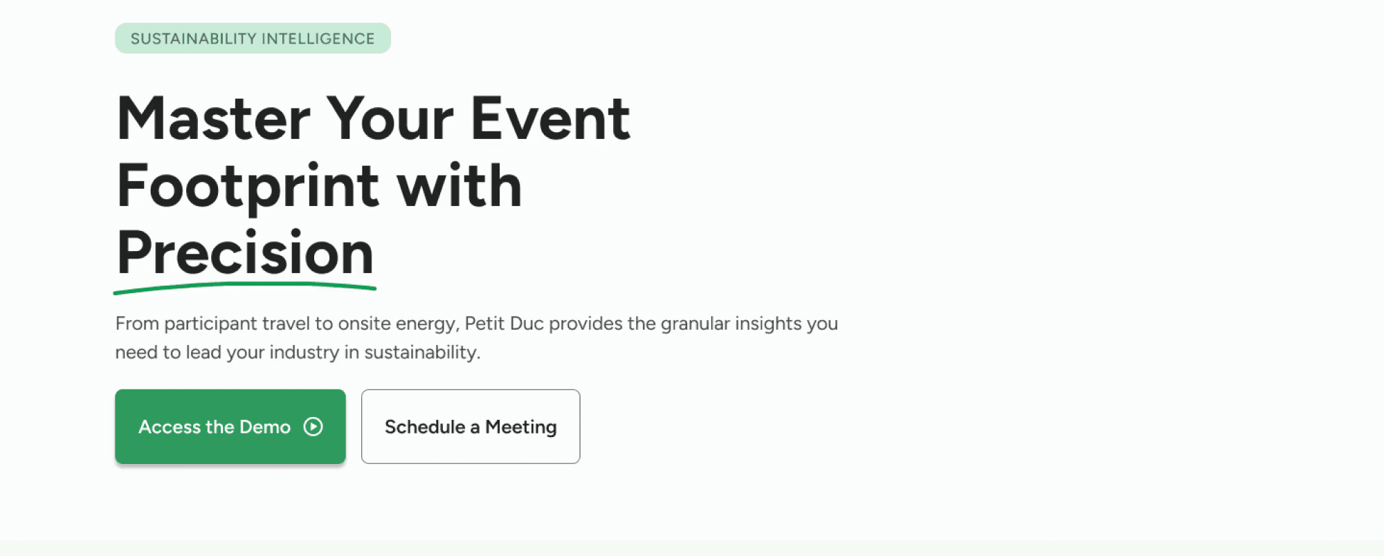
Features
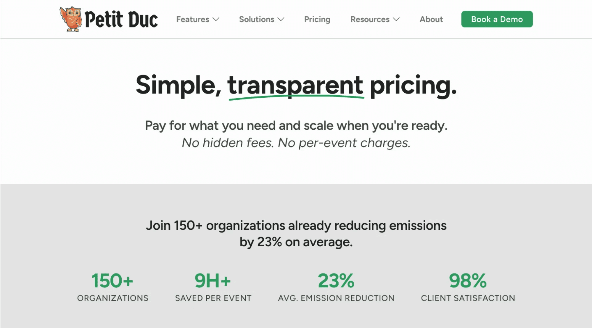
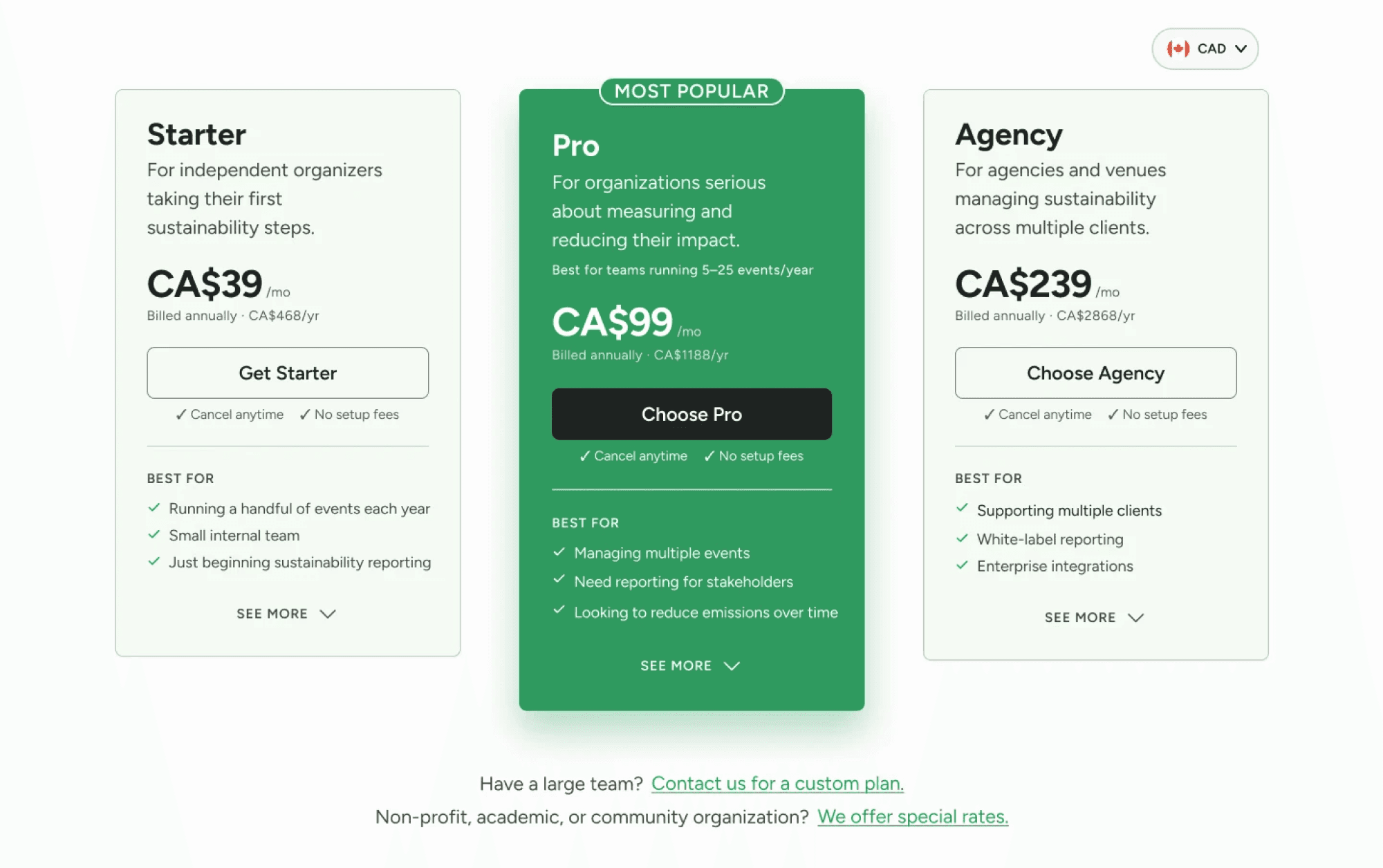
Pricing
Book a Demo
Contact
Key Highlights
Clearly communicates Petit Duc's value proposition
Introduces trust signals & social proof
Guides users towards learning more or booking a demo

View Full Design
Highlights
Explains platform capabilities through benefit-focused content
Uses visual hierarchy to make complex information easier to digest

View prototype
Highlights
Reduces friction by offering simple and flexible scheduling experience
Provides a clear & intuitive path for users ready to take the next step

View prototype
Highlights
Offers multiple ways to get in tough through a simple contact form or direct email
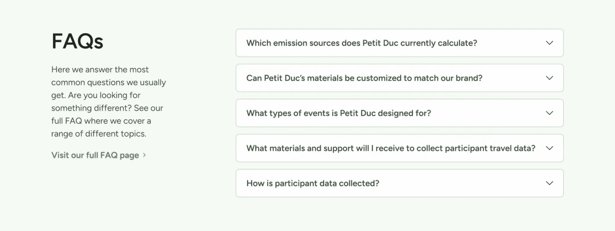
Answers common questions upfront with a FAQ section, helping users find information before reaching out

View prototype
Validation
To evaluate the redesign, we conducted moderated usability testing with 3 participants using task-based scenarios focused on exploring the website, understanding Petit Duc's value proposition, comparing pricing, & booking a demo.
Usability Testing Tasks
Task 1: First impression & understanding the product
Task 2: Learn about the product
Task 3: Evaluate trust & credibility
Task 4: Book a Demo
Key Findings
Finding 1
Users quickly understood Petit Duc's value proposition
Clear messaging & stronger visual hierarchy helped participants understand the platform within seconds.
Finding 2
The redesigned navigation improved discoverability
Participants found key pages with little hesitation & appreciated the simplified navigation structure.
Finding 3
The booking a demo flow felt straightforward
Participants easily located the Book a Demo page & understood the next steps without confusion.
Finding 4
Users felt the company credible with overall trust rating 4.5 out of 5
Positive feedback on overall UI— clean, friendly & professional.
Iterations
Usability testing informed several design refinements across the experience.
Below are three key iterations, with the complete annotated design log available in Figma.
Iteration 1: Improved Feature Discoverability
Product workflow section on Features page is text-heavy and lacking visual elements to demonstrate how the product works. 3/3 participants with different backgrounds & goals landed on this identical gap.
Impact:
Replacing the static feature cards with expandable accordions made feature exploration more intuitive, engaging, & reduced visual clutter.
Before

After

Iteration 2: Stronger Trust Before Conversion
Supporting & trust content wasn't sequencing based on what the user needs at each specific step as success metrics appeared after Book a Demo or Pricing, which was too late for someone still forming a first impression.
Impact:
Placing trust signals closer to the primary call-to-action (CTA) in the Homepage reinforced trust at the point of conversion.
Before

After

Iteration 3: Simplified Pricing Comparison
Compare Plans section needs restructuring as the collapse Pricing cards appeared to come after supporting content (trust stats, descriptive copy) forcing users to scroll past it just to compare plans.
Impact:
Reorganizing the pricing information & eliminated expandable info in the Pricing cards simplified plan comparison, and helped users understand pricing differences more quickly.
Before

After

The final redesign presents Petit Duc's platform with greater clarity, stronger credibility, and a more intuitive user journey. These improvements were driven directly by research and iterative usability testing.
View Final Prototype
*Update: Since this project concluded, 🔗Petit Duc has implemented the redesigned website, bringing many of the proposed improvements into production.
Reflection
Working with real constraints
Working with a real client made this project especially valuable because every design decision needed to balance user needs with business goals. Throughout the project, we collaborated directly with stakeholder, presented our design rationale, and iterated based on feedback.
Challenges
One challenge was collaborating across a three-person team while maintaining consistency across independently designed pages. Regular communication and design reviews helped us create a cohesive final product despite dividing ownership of different sections of the website.
Another unexpected challenge was designing around incomplete content. Since the client hadn’t finalized much of the website copy, our team used AI to generate realistic placeholder text that reflected Petit Duc’s product and brand.
This allowed us to prototype complete user flows and complete meaningful usability testing, while recognizing that the final messaging would continue evolving. It reinforced the importance of adapting to ambiguity and making informed design decisions with the information available.
Key Takeaways
Trust is communicated through both content and visual design
Simplicity often creates more confidence than adding more information
Designing for a real client requires balancing user needs with business goals
Good UX is about helping users make decisions with confidence
If I had more time
I would continue testing the redesigned website with more users and measure whether the updated content and navigation improved conversion rates after launch.